In a review of Carleigh Baker’s debut short story collection, Bad Endings, the Globe and Mail called Baker “a keen observer of contradiction and its implications..” Here, the author discusses the complex beauty of her book’s cover.
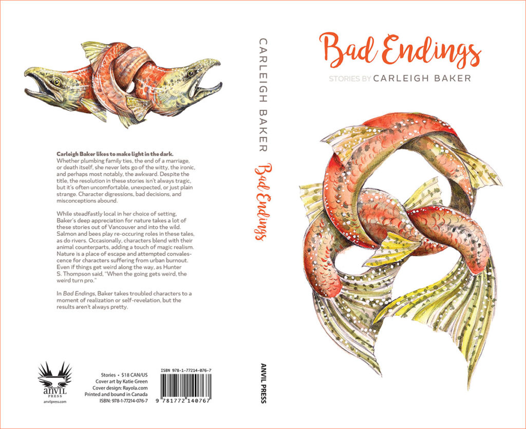
The cover art for Bad Endings was painted by Katie Green, a very talented artist who lives on Treaty 7 territory, in Calgary. On her website, Katie is described as a “visual artist whose practice addresses nature as a crossroad for developing concepts of growth, death, adaptation, cooperation, and perhaps most importantly, our emotional and physical selves.” Katie and I have been friends for a few years, and I can say this describes her perfectly, and it’s exactly why I asked her to do the art for the book.

There’s so much emotional messiness in Bad Endings, but (hopefully) a lot of beauty as well, and this is often expressed through relationships with nature. Particularly fish and rivers, as well as bees. Katie does such amazing work exploring emotional extremes through natural themes. She also uses a lot of “grotesque” imagery, that is to say, nature made strange—like exquisite corpse-style drawings and murals, in which heads of birds transition into grasshopper thoraxes and spiral into serpent tails. She’s painted murals in Nepal, India, Florida, Sri Lanka, and Taiwan, and they are always very beautiful, quite weird, and a little bit frightening.
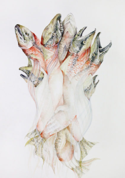
 I’d known for a long time that I’d wanted salmon on the cover of Bad Endings, and after seeing a breathtaking watercolour by Katie, in which a bunch of salmon are clumped together into a teeming mass, with mouths that could be gasping for air, or could just as easily be screaming in agony, I knew Katie and I would come up with something wonderful for the cover.
The language I’m using might suggest that Katie’s work is coarse or violent, but it’s just the opposite. These intense themes are presented with such delicate intricacy, such love, each image suggests layers of complexity that give her work a distinct narrative quality. Viewers might be thinking “how beautiful!” but they will probably also be wondering “how did it come to this?”
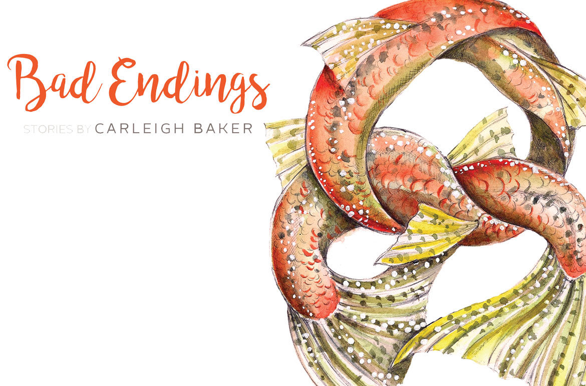
I believe that if you have a relationship with an artist, trusting them implicitly allows them to work freely and in a way that benefits both parties. So, I basically told Katie that I wanted salmon, and that I kind of wanted them to be tied in knots—tails for the cover and heads for the back—and she did the rest. I cried when she sent me the final product.
Publishing your first book is stressful—I’m sure the second and third books are stressful too, but knowing that my first little collection of stories would be represented by such beautiful and evocative work allowed me to breathe easier. I am forever thankful to Katie, and in awe of her talent.
Bad Endings: Stories, by Carleigh Baker, was published by Anvil Press. Cover art by Katie Green. Cover design by Rayola.com.

